 Skip to content

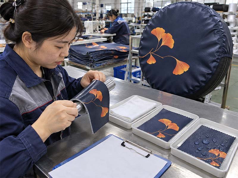
A tire cover can look remarkably simple when it is mounted on the back of a vehicle: a round piece of flexible material carrying a logo, illustration, photograph, or brand message. The printing challenge becomes much more complicated when the front panel is made from PU. Two materials may both be sold as “PU leather,” yet one may produce crisp lettering and smooth gradients while another makes the same artwork look softer, patchier, or less defined. The printer is not always the reason. Much of the difference begins with the surface itself.
PU surface texture affects tire cover printing by changing ink contact, image sharpness, apparent color, adhesion, and fine-detail reproduction. Smooth and fine-matte PU generally provide the most predictable surface for photographs, gradients, small lettering, and detailed illustrations. Fine or moderate grain can work extremely well for logos and automotive-style branding, while deeper embossed grain usually requires simpler artwork and more careful process validation. Ink chemistry, topcoat formulation, curing, and flexibility remain just as important as the visible texture.
The most expensive mistake is often made before the printer is switched on. A material may be selected because it feels premium in the hand, a digital proof may look perfect on a monitor, and the first production sample may still reveal that a small tagline disappears into the grain. In another project, the print may look excellent on day one but begin whitening or lifting around folds because the ink system and PU coating were never tested together. Understanding the relationship between texture, artwork, ink, and real tire-cover use is what turns an attractive sample into a repeatable product.
What PU Surface Textures Are Used for Tire Covers?

PU tire covers can use smooth matte, fine matte, fine leather grain, automotive grain, pebble grain, cross grain, and more heavily embossed surfaces. Smooth and fine-matte constructions are generally selected when print detail is the priority, while stronger grain is used when tactile value and an automotive appearance matter more. The best choice depends on the artwork, print method, flexibility, finish, and expected outdoor use.
Smooth Matte PU
Smooth matte PU is usually the first material worth evaluating when graphic reproduction is central to the product. “Smooth” does not mean the material has to feel like a plastic film. A well-designed printable grade can still have the soft hand, flexibility, and premium appearance associated with synthetic leather while keeping the front surface controlled enough for reliable ink deposition. The low-gloss finish also reduces reflections that can make photographs and darker artwork harder to read outdoors.
A documented printable PU platform used for tire-cover development falls around 0.45–0.60 mm in thickness and 380–520 g/m², with smooth matte or fine-matte surface characteristics. More importantly, the material specification does not define printability by appearance alone. Stable surface energy, uniform coating, low contamination, low migration, and good ink adhesion are treated as core requirements because they influence whether ink can wet, cure, and remain attached to the surface consistently.
This kind of PU works particularly well for photographic tire covers, gradient backgrounds, complex multicolor logos, detailed illustrations, and artwork containing relatively small supporting text. The even face gives the printing system a more predictable working plane, while the matte appearance helps preserve an automotive feel. For a custom program where the graphic itself is a major part of the product value, the difference between ordinary PU and purpose-selected printable PU is often more important than a small difference in material cost.
Fine-Grain PU
Fine-grain PU is a useful middle ground when the product needs to feel more like an automotive accessory without sacrificing too much graphic clarity. Instead of removing texture, the grain is kept shallow and visually controlled. Fine leather grain and restrained automotive grain are common examples. From normal viewing distance, the surface still has depth and character, but the peaks and recesses are not aggressive enough to dominate most logos, badges, names, or medium-detail illustrations.
This surface is attractive for premium vehicle-accessory ranges because the material contributes to the appearance even before anything is printed on it. A completely smooth panel can provide excellent graphic reproduction, yet some brands prefer a finish that visually relates to vehicle trim, synthetic upholstery, dashboard textures, or other automotive surfaces. Fine grain can provide that impression while still allowing good print definition when the artwork is designed with the surface in mind.
The important point is that “fine grain” is a commercial description, not a universal technical standard. Grain depth, embossing density, topcoat chemistry, backing construction, gloss, and finishing additives can vary considerably between suppliers. Two rolls may both be described as fine leather PU but respond differently to UV, Latex, screen printing, or heat transfer. For repeat manufacturing, the physical material, approved supplier, coating version, and tested print conditions should therefore remain linked to the product specification.
Deep-Grain PU
Deep-grain PU is chosen when the surface itself is expected to create part of the product’s perceived value. Common options include automotive grain, pebble grain, fine leather grain, cross grain, heavy grain, and custom embossed textures. In the documented tire-cover material system, Textured PU commonly sits around 0.60–0.80 mm thick and 500–700 g/m², normally supported by a high-density polyester backing that helps maintain structure and sewing performance.
Deeper texture changes printing because the image no longer sits on one nearly flat plane. Ink must cover raised peaks, sloped transitions, and recessed valleys. Large logos and strong graphic shapes may still look excellent because the eye reads the complete form from a normal distance, but very fine photographic information becomes more vulnerable to local shadow, surface interruption, and variations in apparent density. The material is not necessarily worse; it simply serves a different design purpose.
For a black Jeep or Bronco tire cover carrying a large white emblem, pronounced automotive grain can make the final product look more integrated with the vehicle. For a detailed pet photograph containing individual hairs, eye reflections, and fine tonal transitions, the same grain can become a disadvantage. Internal material guidance reflects this distinction: deeper texture is less suitable for fine photographic reproduction, while logos and simple graphics remain highly compatible.
| PU Surface | Typical Specification | Best Use | Main Printing Consideration |
| Smooth / Fine Matte Printable PU | 0.45–0.60 mm; 380–520 g/m² | Photos, gradients, detailed logos, small text | Surface energy and coating consistency must be controlled |
| Fine Leather Grain | Project-specific | Premium logos, badges, medium-detail graphics | Check thin lines and smallest text |
| Automotive Grain | Project-specific | Vehicle accessory branding | Grain may visually soften fine elements |
| Textured PU Platform | 0.60–0.80 mm; 500–700 g/m² | Bold graphics, premium automotive styling | Deeper texture reduces photo clarity |
| Heavy Grain | Project-specific | Large simple marks and wordmarks | Texture can dominate small artwork details |
How Does PU Texture Affect Print Quality?

PU texture affects print quality because ink is applied to a physical three-dimensional surface rather than an ideal digital plane. As grain becomes more pronounced, it can change edge sharpness, apparent color density, white-ink coverage, and the visibility of small details. Smooth or fine-matte PU generally preserves high-information graphics best, while textured PU performs well when artwork depends more on strong shapes and contrast.
Print Sharpness
Print sharpness is easiest to evaluate around letter edges, circles, fine borders, signatures, and narrow line work. On a controlled smooth surface, the boundary between printed and unprinted areas can follow the artwork closely. On embossed PU, the same edge crosses different heights and angles. The result may still look clean from a few meters away, but small details can appear less consistent when viewed closely or photographed for an online product listing.
The effect becomes more noticeable as the smallest artwork element becomes smaller. A large 200 mm logo may remain highly recognizable on obvious grain, while a thin registered mark, narrow slogan, or small serif letter can lose definition. This is why printer resolution by itself does not determine the finished result. A high-resolution printhead can place droplets accurately, but it cannot remove the physical peaks and valleys underneath those droplets.
Actual viewing distance should be considered when judging quality. Tire covers are often seen from several meters behind a vehicle, which means microscopic imperfections may have little practical effect on a large emblem. The same cover may later be photographed at close range for an e-commerce page or catalog, where those details become far more visible. Sample approval should therefore include both normal-use viewing and close inspection at the actual production size.
Color Appearance
Surface texture can change the way a printed color appears even when the digital color values and ink formulation remain unchanged. Part of the difference comes from ink coverage, but much of it comes from light. Matte, semi-matte, and embossed surfaces scatter and reflect light differently, so the same red, blue, or black can appear slightly darker, lighter, or less saturated depending on the grain and viewing angle.
This is particularly important for branded products using Pantone targets. A Pantone reference provides a useful color target, but it cannot guarantee an identical visual result across every PU surface. Printing process, ink, substrate color, white underbase, coating, and texture all influence the final appearance. The documented color workflow used for tire-cover projects therefore treats Pantone as a controlled reference and can use digital proof plus physical sample approval when the color is commercially important.
Dark PU introduces another layer of complexity because normal CMYK inks do not create the same brightness over black or charcoal substrates. White ink or another opaque base may be required before the color image is printed. That additional layer can improve color accuracy, yet it also affects ink-film thickness and flexibility. For repeat production, matching the approved material surface and print configuration is often just as important as keeping the same artwork file.
Photo and Gradient Detail
Photographs demand more from the substrate than most logos because they contain a high concentration of visual information. Faces, hair, fur, vehicle reflections, foliage, fabric texture, shadows, and subtle tonal transitions may all need to remain recognizable. When the PU surface has heavy embossing, the grain adds another visible pattern over the image, which can reduce the perceived smoothness of detail even when the printer itself is producing accurate dots.
Not all photographs react equally. A mountain landscape with broad areas of sky and large dark shapes may still look very effective on moderately textured PU. A close-up portrait containing eyelashes, whiskers, hair strands, and small highlights benefits much more from a smooth matte surface. Gradients behave similarly because they rely on smooth tonal progression, and changing surface angles can make those transitions look less even under directional light.
For this reason, Printable PU and strongly Textured PU should not be treated as interchangeable simply because both are made from polyurethane-based synthetic leather. The documented material evaluation specifically records stronger suitability for logos and simple graphics on Textured PU while reducing the rating for fine photographic work as texture depth increases.
Practical Print Review
A useful sample review should focus on the details that are most likely to fail rather than simply deciding that the cover “looks good.” The smallest readable text, thin borders, circular lines, gradient areas, solid white sections over dark PU, facial features, and high-contrast edges reveal much more about substrate suitability than a large central logo. A material that works perfectly for one design may not be suitable for another design using the same printing machine.
- Check the smallest text at actual production size.
- Examine thin outlines for interruptions across the grain.
- View the cover both close up and from normal vehicle distance.
- Inspect gradients under direct and angled light.
- Check large solid-color areas for apparent density variation.
- Review white underbase coverage on dark PU.
- Compare photography and fine illustration against the digital reference.
- Decide whether the grain improves the product or competes with the artwork.
Which Printing Methods Suit Each PU Texture?

UV digital, Latex, screen printing, and heat transfer can all work on selected PU tire-cover materials, but each responds differently to texture and surface chemistry. UV is particularly useful for white ink and detailed graphics, Latex suits validated flexible printable surfaces, screen printing performs strongly with bold limited-color designs, and heat transfer requires careful control of temperature, pressure, adhesion, and material response.
UV Digital Printing
UV digital printing is one of the most versatile methods for PU tire covers when the design includes white ink, gradients, multicolor artwork, spot colors, or printing over dark material. Because the ink is cured rapidly at the surface, the process can create strong opacity and good detail on compatible coated substrates. It is particularly useful when a brand wants dark PU to remain visible around a high-contrast white or multicolor logo.
The documented UV platform used for tire-cover work accepts PU among its compatible materials and supports full color, white logos, gradients, fine detail, spot color, dark-material printing, and premium branding. Its recorded maximum print width is 1,610 mm, or approximately 63.4 inches, which is sufficient for normal soft spare-tire-cover face panels. Each new material still needs adhesion testing before it is accepted for normal production use.
The limitation is not usually whether UV can place the image onto the surface. The more meaningful question is whether the cured ink layer remains compatible with a flexible product. Tire covers are folded, sewn, packed, stretched, installed, removed, and exposed to temperature changes. A print that looks excellent on a flat sample may still develop whitening, fine cracks, or edge lift if the ink film and PU do not flex together. For this reason, visual quality and mechanical validation should be treated as separate approval steps.
Latex Printing
Latex printing works well for photographs, gradients, personalized graphics, and variable artwork when the PU surface has been specifically verified for the process. It is especially practical when many different designs need to be produced without building separate screens, making it suitable for custom collections, personalized products, and programs where each SKU carries different artwork.
A documented Latex production setup for tire-cover applications supports selected PU together with printable PVC, synthetic vinyl, marine vinyl, canvas, and compatible textiles. The platform handles media up to 64 inches, approximately 1.63 meters, which provides ample width for common tire-cover graphics. The printing system can deliver full-color photographs, illustrations, gradients, and complex logo work when the substrate and profile are correctly matched.
The word “selected” is important. Not every PU surface is automatically printable with Latex. Internal manufacturing guidance specifically notes that different PVC and PU surfaces require verification and that non-printable surfaces may show insufficient adhesion. Dark substrates can also require a white underbase depending on the intended graphic. The process may therefore be technically compatible with PU in general while still being visually unsuitable for a heavily embossed grade used for a detailed photograph.
Screen Printing
Screen printing remains extremely useful for tire covers carrying simple logos, solid colors, promotional marks, dealership branding, club graphics, and repeat production. It does not attempt to reproduce photographic tonal complexity in the same way as digital printing. Its strength lies in controlled spot-color coverage, strong visual density, and efficient repetition when the artwork is suited to the process.
In the documented production guidance, 1–4 colors represent a particularly practical range for screen printing. Additional colors are possible, but each one adds screens, registration work, setup time, and cost. Pantone references can be used as production targets when the ink system is compatible with the selected PU or coated substrate.
Texture can actually work in favor of screen-printed products when the design is bold. A large one-color wordmark on fine or moderate automotive grain does not depend on tiny gradients or microscopic detail, so the grain becomes part of the overall product style. Deep texture still needs trial printing because ink viscosity, mesh, pressure, coverage, and curing all affect how well recessed areas are filled. For larger repeat orders using stable limited-color artwork, screen printing can offer a practical balance of appearance and production efficiency.
Heat Transfer
Heat transfer can create sharp graphic boundaries and is useful for certain specialty logos or decorative layers, but it adds temperature and pressure to a PU material that may be sensitive to both. Polyurethane-based synthetic leather varies widely in topcoat formulation, backing, softness, thickness, and thermal behavior. A transfer condition that works perfectly on one grade can change gloss, flatten grain, soften the coating, or leave a visible press area on another.
Flexibility must also be considered. A transferred graphic often introduces its own adhesive and film structure. If that layer is significantly less flexible than the PU beneath it, repeated folding or stretching can create edge lift or cracking. An immediate peel test may look acceptable while longer-term movement reveals the weakness later.
For this reason, heat transfer should be validated on the exact production PU using the intended temperature, pressure, dwell time, and transfer material. Generic tests on another type of synthetic leather are not enough. The sample should be allowed to cool completely and then checked for surface marking, adhesion, folding behavior, scratching, and repeated flexing before the process is released for repeat production.
| Printing Method | Strongest Application | Preferred PU Surface | Useful Production Data | Main Validation |
| UV Digital | White ink, dark PU, fine detail, full color | Smooth to moderate grain | Up to 1,610 mm documented width | Adhesion, bend, fold, scratch |
| Latex | Photos, gradients, variable artwork | Printable smooth / fine grain | Up to 64 in / ~1.63 m | Adhesion and surface compatibility |
| Screen Printing | Bold logos, solid spot colors | Fine through moderate grain | 1–4 colors often most practical | Coverage, registration, adhesion |
| Heat Transfer | Sharp specialty logos | Compatible smooth / fine PU | Temperature and pressure are material-specific | Heat marking, peel, flexibility |
How Does PU Texture Affect Ink Adhesion?
PU texture influences ink adhesion, but texture alone does not determine whether a print will remain attached. Surface energy, topcoat chemistry, contamination, coating uniformity, ink formulation, curing, and material flexibility are equally important. A textured surface can provide more physical area, yet a chemically incompatible or contaminated coating may still fail even when the freshly printed graphic looks visually perfect.
Surface Energy and Topcoat
Commercial PU leather is an engineered multilayer material. The visible face is often modified to control gloss, abrasion resistance, stain resistance, hand feel, embossing, anti-block behavior, and other functional properties. These finishing decisions also influence printing because the ink interacts primarily with the topcoat rather than with the underlying PU structure or textile backing.
Ink needs to wet the surface sufficiently before it can form a reliable bond. If surface energy is unsuitable for the ink system, the liquid may retract, bead, or form a weak interface. This can occur even on a visually smooth PU surface. Conversely, a lightly textured surface can print very well when its coating is chemically compatible and stable.
This explains why a useful Printable PU specification includes more than thickness and weight. The documented standard requires stable surface energy, uniform coating, low contamination, low migration, and good ink adhesion. A material quotation reading only “black PU leather, 0.5 mm” is therefore not enough to predict printing performance for a repeat custom tire-cover program.
Grain Depth and Coverage
Deep grain can reduce uniform ink coverage because the printing process must reach raised peaks, recessed valleys, and angled transitions within the same graphic area. This is particularly visible in high-opacity white printing over black PU. The raised areas may look bright and dense while deeper recesses appear slightly darker, creating apparent inconsistency even when some ink is present across the entire surface.
Simply increasing ink deposition is not always the best solution. A thicker ink film may improve local opacity, but it can also change flexibility, surface feel, curing behavior, and resistance to folding. More ink can solve one visual problem while creating a mechanical one, especially on a tire cover that must remain soft enough to fold and stretch around the spare tire.
Artwork adaptation is often the more reliable approach. Increasing thin line weight, enlarging small lettering, opening narrow negative spaces, and simplifying unnecessary detail can produce a stronger final result on textured PU without pushing the printing system beyond practical limits. This is why good production artwork is not only a digital file; it is artwork adjusted for the material and manufacturing process that will actually be used.
Contamination and Preparation
Contamination is one of the less obvious causes of PU print failure. A roll can look perfectly clean while carrying migrated additives, release agents, oils, dust, handling residue, or surface treatments that interfere with ink wetting and adhesion. When a printing process works consistently on one material batch but performs poorly on another visually similar batch, the PU surface itself should become one of the first variables investigated.
Depending on the coating and printing method, preparation may involve controlled cleaning, primer, or another validated treatment. There is no universal primer that should automatically be applied to every PU. The treatment must improve the interface without damaging surface appearance, flexibility, or long-term performance.
Adding preparation also creates additional variables that must remain controlled during repeat manufacturing. Primer amount, drying time, application uniformity, storage, operator handling, and contamination after treatment can all influence the final result. A purpose-developed Printable PU may therefore have greater commercial value than its material price alone suggests because it can reduce rework, reject rates, corrective processing, and inconsistent repeat orders.
Flexing in Real Use
A tire cover behaves very differently from a rigid sign panel. It may be folded for storage, compressed inside packaging, unfolded, pulled around a tire, stretched over curved surfaces, removed for vehicle maintenance, cleaned, and exposed to heat and cold. Those repeated movements put the printed layer under mechanical stress that cannot be evaluated by looking at a freshly printed flat sample.
Ink and PU need to deform together. If the cured print film is substantially less flexible than the substrate, repeated movement can create microcracking, whitening, edge lift, or localized delamination. A basic adhesion test may therefore be necessary without being sufficient. The product still needs to survive abrasion, folding, and the actual handling conditions expected during its life.
The documented testing system separates adhesion from scratch resistance. Print adhesion can be screened through cross-hatch or tape-pull methods adapted to flexible material, while scratch testing is designed to simulate friction caused by handling, packing, installation, and cleaning. New printable materials must pass the adhesion requirement before entering the approved printable-material pool.
Which Artwork Works Best on Each PU Texture?

Smooth and fine-matte PU are the safest choices for photographs, gradients, small typography, thin outlines, and detailed illustrations. Fine or moderate grain can reproduce most normal-size logos and badges effectively, while deep grain is usually better suited to bold shapes, strong contrast, and larger lettering. Good artwork selection respects the physical resolution of the material instead of forcing every design onto every texture.
Photographs and Full-Color Artwork
Photographic tire covers benefit from a controlled surface because a photograph contains far more visual information than a simple logo. Faces, hair, fur, reflections, vehicle details, landscapes, shadows, skin tones, and subtle color transitions all depend on fine information surviving the move from a digital file to a flexible physical substrate.
Smooth matte Printable PU is normally the first material to evaluate when the photograph is the main selling point of the product. Its relatively even surface allows small tonal information to remain visible, while a low-gloss finish reduces distracting reflections. White or light PU also provides a neutral foundation for full-color printing. Dark PU can still be used, but a suitable white underbase may be needed to maintain brightness and color accuracy.
The correct choice also depends on the image itself. A bold mountain landscape may tolerate light grain better than a close-up pet portrait with whiskers and individual hair detail. An American flag graphic with broad color areas may remain powerful on moderate texture, while a portrait containing subtle skin tones benefits from maximum surface uniformity. The highest-information part of the artwork should therefore drive the material decision.
Logos and Brand Marks
Logos generally tolerate PU texture better than photographs because effective identity systems rely on recognizable shapes, controlled typography, solid colors, and strong contrast. Fine leather grain and automotive grain can therefore be excellent choices for dealership logos, club emblems, private-label collections, Jeep accessories, Bronco accessories, and other vehicle-focused products where the material itself contributes to a premium appearance.
Scale remains important. A large 200 mm emblem can look clean on a surface where a 10 mm supporting line becomes difficult to read. When one design contains both a dominant mark and very small secondary text, the smallest required element usually determines whether the grain is suitable. Circular tire-cover artwork deserves similar attention because curved text can become visually tighter as it follows the round face.
Moderate texture can also improve the overall visual language of a premium product. A matte black automotive-grain PU carrying a restrained white wordmark may look more intentional and vehicle-specific than the same logo on a completely smooth photographic surface. The most successful products treat the artwork and material as one design system rather than selecting each independently.
Fine Text and Thin Lines
Fine typography, signatures, small trademark symbols, narrow borders, and delicate geometric details are usually the first parts of artwork to expose the limitations of deep grain. A line that is perfectly clean in the vector file may cross several peaks and recesses over only a few millimeters of physical distance, causing the viewer to perceive changes in weight or continuity.
Artwork optimization can often solve the issue without abandoning the preferred PU. Increasing line weight slightly, opening narrow negative spaces, enlarging small secondary text, simplifying fine decorative details, and adjusting spacing can make a significant difference. These changes do not necessarily alter the brand identity; they adapt the design to the manufacturing surface.
Evaluation should always be performed at 100% production size. Enlarging a logo on a monitor can hide the relationship between line width and material grain. For essential legal, regulatory, or brand text that must remain clearly readable, smooth or fine-matte PU is normally the safer choice. For decorative details, modest artwork adjustment may provide a better balance between texture and appearance.
Bold Graphics on Textured PU
Textured PU performs especially well with artwork that relies on large visual masses rather than delicate tonal information. Strong wordmarks, outdoor icons, flags, monograms, simplified mountains, club badges, compass graphics, and one- or two-color emblems remain readable even when the material surface introduces visible grain.
In these designs, the material and artwork support each other instead of competing. The grain provides tactile and automotive character, while the graphic provides instant recognition. The documented Textured PU evaluation follows this logic, showing strong suitability for logos and simple graphics while reducing suitability for fine photographic work as grain becomes deeper.
A product range also does not need to force one PU across every design. A brand may use smooth Printable PU for a photographic collection and a deeper automotive grain for a minimalist logo series. This approach can create a stronger overall range because each material is selected according to what the artwork needs rather than according to an arbitrary requirement that every SKU use the same surface.
| Artwork Type | Preferred PU Surface | Practical Alternative | Main Production Check |
| High-detail photograph | Smooth / fine matte | Very fine grain | Facial detail, gradients, color |
| Multicolor illustration | Smooth / fine matte | Fine grain | Thin lines and tonal transitions |
| Large brand logo | Fine matte / fine grain | Automotive grain | Edge clarity and solid coverage |
| Simple 1–4 color graphic | Fine to moderate grain | Deeper grain after testing | Coverage and registration |
| Small typography | Smooth / fine matte | Fine grain after proofing | Legibility at actual size |
| Bold badge or emblem | Fine / automotive grain | Pebble or cross grain | Contrast and overall coverage |
How Do You Test PU Before Bulk Printing?
PU should be approved as a complete material-and-print system rather than as a material name alone. Practical validation includes print adhesion, scratch resistance, folding or bending behavior, color, material identity, and artwork approval. Premium outdoor projects may also require accelerated UV, coating adhesion, color-change, and hydrolysis evaluation. A physical approved sample then provides the reference that repeat production is expected to reproduce.
Print Adhesion
Print adhesion testing is intended to detect a problem that visual inspection cannot reliably identify. Fresh ink can look saturated, sharp, and perfectly positioned while bonding only weakly to the PU topcoat. If that weakness is not discovered before production, packing, flexing, cleaning, or outdoor use may reveal the failure long after the product has left the factory.
The documented print-adhesion system used for tire-cover materials applies to Latex, UV, screen, and transfer printing. Quick checks can include cross-hatch/tape pull or tape-adhesion methods suitable for flexible substrates. The acceptance principle is practical: clearly visible large areas of the ink film should not be removed, and a new material must achieve a print-adhesion pass before it is released into the approved printable-material pool.
Traceability matters as well. A statement that “PU has already been tested” has limited value if the current order uses another supplier, topcoat, color, or finishing process. For repeat programs, the material code, printing process, sample result, and production specification should remain connected so that later orders can be compared with the same approved reference.
Scratch, Bend, and Fold Performance
Scratch resistance and adhesion are related but not identical. Ink may bond strongly to PU while still scuffing too easily during handling. A harder print film may resist scratching yet become brittle around folds. This is why flexible tire covers require more than one type of mechanical check before a demanding program is approved.
The documented scratch test is intended to simulate surface contact during handling, packing, installation, and cleaning. Depending on the material, evaluation can include rubbing, scratch-stylus methods, or weighted abrasion. Failure conditions include large-area ink loss, delamination, and surface peeling. The broader material-approval sequence also includes fold, print-adhesion, scratch, water-resistance, and cold-flex checks.
Premium outdoor programs can add accelerated UV exposure, color-change evaluation, coating adhesion, and hydrolysis testing for PU. These tests answer different questions rather than duplicating one another. Adhesion checks bonding, scratching checks surface resistance, folding checks mechanical flexibility, cold flex examines low-temperature behavior, and UV exposure evaluates longer-term changes such as fading, yellowing, cracking, or coating deterioration.
Color Approval
Color approval should move from a digital target to the actual printed substrate whenever color accuracy has commercial importance. Computer screens are useful for reviewing layout, proportion, and general appearance, but they cannot reproduce the effect of surface grain, gloss, substrate color, white ink, curing, and outdoor lighting.
A customer may provide Pantone C, Pantone U, brand guidelines, existing products, physical color samples, or previous logo references. These establish a target, yet the final visual result remains influenced by printing method, ink, substrate, white base, and PU surface texture. The documented production-color workflow specifically recognizes those variables and supports digital proof plus physical sample confirmation where necessary.
The same issue appears when a brand uses several PU textures within one collection. A nominally identical Pantone red can appear slightly different on smooth matte and embossed PU because the surfaces reflect light differently. Production artwork should therefore identify the approved material and printing method together with the color target rather than storing only a Pantone number.
Golden Sample Approval
The Golden Sample is the point where material, texture, artwork, printing, construction, and appearance are approved as one physical product. For a custom printed PU tire cover, this should include more than checking that the graphic is centered. Material grade, surface texture, finished size, print position, logo scale, color, sewing, fit, camera-hole relationship where applicable, and overall appearance should all match the agreed production specification.
Important OEM and custom-development projects can move through First Sample, Revised Sample, and Golden Sample stages before bulk production. Once material, pattern, artwork, and Golden Sample are confirmed, manufacturing can reproduce an established standard rather than interpreting the original request from the beginning each time.
Production artwork should remain under the same control. The documented workflow records artwork revision, tire-cover size, print area, artwork position, camera safe zone, bleed, color, Pantone target, material, printing method, and additional production notes. For repeat programs, this combination of physical reference and controlled production data is far more dependable than relying on photographs, memory, or a general description such as “black textured PU.”
Conclusion
A successful printed PU tire cover is not created by choosing the highest-resolution printer or the most expensive synthetic leather. The result comes from matching surface texture, coating chemistry, artwork complexity, printing process, ink flexibility, color requirements, and real product use. Smooth or fine-matte Printable PU is usually the safest route for photographs, gradients, small typography, and high-detail illustrations, while fine and deeper automotive grains can be excellent choices for strong logos and premium vehicle styling.
The most reliable development process treats material and printing as one system. A sample should show not only whether the artwork looks attractive but whether the ink remains attached, survives bending and scratching, maintains acceptable color, and can be reproduced consistently in later production. When a project involves unusual PU, strict branding, complex artwork, outdoor exposure, or repeat-volume requirements, Szoneier can evaluate the surface, printing method, artwork, and validation process together before the combination becomes a large production commitment.
Frequently Asked Questions
Is smooth PU always better for tire cover printing?
Smooth PU is not automatically better for every tire cover. It usually provides the most predictable surface for photographs, gradients, fine lettering, and intricate artwork because there are fewer physical peaks and valleys interrupting the image. A fine or moderate automotive grain may produce a more premium finished product for a large logo or simple emblem. The better choice depends on whether graphic detail or material character is more important to the design.
Can you print a photograph on textured PU?
A photograph can be printed on textured PU, but the amount of visible detail depends on grain depth, image content, ink system, and viewing distance. Moderate grain may work well for landscapes, flags, vehicles, and other images containing broad shapes. Deep grain is less suitable for portraits, fur, hair, fine shadows, and subtle gradients. When photographic detail is central to the product, smooth or fine-matte Printable PU is usually the safer starting point.
Which printing method is best for PU tire covers?
There is no single printing method that is best for every PU tire cover. UV digital printing is strong for white ink, dark substrates, full color, and detailed graphics. Latex printing can work well on validated printable PU for photographs and variable artwork. Screen printing is highly practical for bold limited-color logos, especially in repeat production. Heat transfer can also work, but temperature, pressure, adhesion, and flexibility must be tested on the actual PU grade.
Does deeper PU grain make ink adhesion stronger?
Deeper grain does not automatically create stronger adhesion. Although a textured surface has greater physical area, ink bonding depends heavily on topcoat chemistry, surface energy, contamination, ink formulation, curing, and flexibility. A rough PU with an incompatible coating can fail more easily than a smooth PU developed specifically for printing. Texture influences coverage and visual appearance, but actual adhesion should be confirmed through material-specific testing rather than predicted from roughness alone.
Why does the same Pantone color look different on two PU surfaces?
The same Pantone target can appear different because surface texture changes how light is reflected and scattered. A smooth matte PU, glossy PU, and automotive-grain PU may therefore create slightly different visual impressions even when the printing settings are similar. Substrate color, white underbase, ink system, curing, and topcoat also affect the result. For commercially important brand colors, a physical sample on the actual production PU provides a more dependable reference than a screen proof alone.
What tests should be completed before bulk PU tire cover printing?
A practical approval program should normally include print adhesion, scratch resistance, folding or bending behavior, material identification, color verification, and physical sample approval. Depending on the expected outdoor conditions, additional checks may include cold flex, water resistance, accelerated UV exposure, coating adhesion, color change, and PU hydrolysis. The exact test plan should reflect the product’s material, printing method, expected climate, order requirements, and the level of repeatability needed for future production.


